
|
'Studio figurativo' & 'Color series #1': AN ANALYSIS
By GIOVANNI RIZZO Published: Thursday, 7 February 2013 |
|
A closer look at the works will reveal what you may have realized already. Both works in spite of their stylistic differences express the same idea. Both works are composed of the same core elements, color shapes and some form of 'silhouette' in black. In 'studio figurativo' that figure takes the form of commonplace, recognizable house elements. On the other hand, the figure in 'color series #1' appears in the form of an "eroded" rectangle or 'bridge' between the left and right sections of the work. This figure does not take the shape of any clearly defined object and thus contributes to the abstract aesthetic of the work. 'Studio figurativo' though portraying 'figurative' or at least identifiable elements remains an abstract work. Aside from their obvious presence in the work, we have no clues as to the dimensions or position of those elements. Consequently, we can argue that the work is not static but dynamic, a space where elements are allowed to move as required by the viewer. In a sense, this quality is more emphasized in 'studio figurativo' than in 'color series #1'. The latter due to its 'fixed' horizontal black shape with sharp, straight edges confers a more static sensation. Finally, in spite of their differences both works strive to stimulate some deep emotion within the viewer. Whether it be anger or happiness, confusion or clarity, the feelings expressed by the viewer are necessary to "complete" the work.
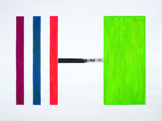
Color series #1, 2012
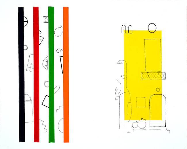
Studio figurativo, 1995
comments powered by Disqus


